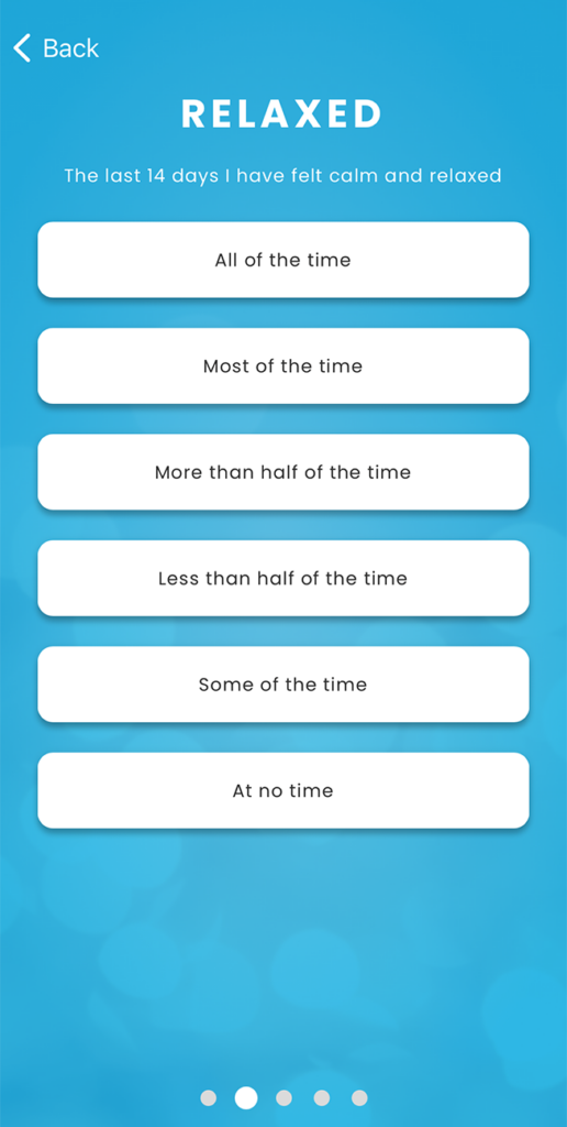
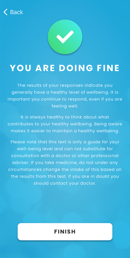
The Howdy-app won a lot of acclaim for its simplicity and ability to get users to stop and reflect. However, recurring feedback been a desire from users to get ”a little more”.
Naturally, we have listened and following a lengthy development process, we are very excited to announce that our app has now been updated with a new, modern visual aesthetic, additional functionality, and a user-friendly interface.
The app is available to both iOS and Android-users. You can download the new app here.


CEO: “The app has been elevated both visually and functionally.”
Howdy-CEO, Rasmus Hartung, is very satisfied that both design and functionality have managed to come together in a new, exciting way:
”The new app has definitely gained a much more modern expression in regard to both design and functionality. We have made a serious effort to elevate the graphical presentation and endeavoured to make it easier to answer our questions and locate additional information, such as tips and tricks, exercise, or your personal history of answers and that is just the start. We have many additional features coming, but this is a starting point, and we expect to be able to be able to continuously surprise positively with an array of new features.”
A focal point of the new app has been not to disturb the user more than necessary but still make them aware, so when it is time to answer the continuous questions on wellbeing:
”We need to maintain a constant awareness not to become another Facebook or Twitter and push notifications constantly—in that regard we can be slightly boring, given that we should not disturb people more than necessary. To us, timeliness and relevance are two key words, which we carry into all considerations of what we do, as we build new technology and introduce new concepts.”
The development process has taken time, however, there has always been a focus on ensuring that design, functionality, and user friendliness all come together.
”We have invested a lot of time in our design, both in the visual aspect, but also in the journey of the user through the different functions—and the whole thing started during a workshop with select customers, who want to help us with the new version of the Howdy app.”
Greater user-friendliness and a more modern experience.
Howdy-CTO, Mads Dørup, is also happy with the result of a lengthy period of product development:
“The app has been designed with a new framework, which offers greater user-friendliness and a more modern experience than the previous version of the feedback. The feedback we have received so far, is that you get a more fluent and polished experience with the design, when you have to answer questions in the app, and there are now additional opportunities to view personal history, receive push-notifications, access additional information on services, and tailored communication from your employer.”
The most important new functions in the Howdy-app version 3.0
Wellbeing overview
The new version of the app has a larger and improved wellbeing overview with a more modern design. It is now possible to view all previous answers to individual questions, view interventions and explanations to answers.
Better guides to additional answers
It is now possible to be guided along to the relevant answers for modules such as Howdy Wellbeing, Howdy Body and personal customised questions regarding work satisfaction, eNPS, etc. In the previous version of the app you had to actively select different surveys yourself.
Push-notifications
Whether they wish to be contacted when it is time to answer has always been optional for the user. In the old app it was possible to be contacted through texts and email. It is now also possible to be contacted through push-notifications when it is time to answer the app. This is a more modern way to receive notifications and makes it easy for the user to get notified.
Redesign
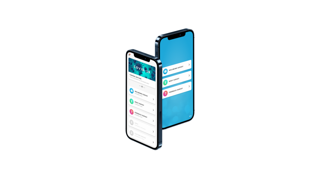
The structure of the menu received an updated look, where the UI has been given more modern presentation with a better overview. Among other improvements, it is now possible to view dates for when next to submit answers.
Carousel slider
At the top of the app, we have included a carousel slider to provide options for finding tips and tricks, information and offers (tailored communication from your company, webinars, etc.) and news.


